Sunday, June 5, 2011

informationn update

for my manual - i have added info about using eyedropper tool, and also layers, just to bulk it up a bit, and so its not all about pen tool. adding a bit more detail.
there is info about pen tool cursors, shortcuts, how to use pen tool, eye dropper and use of colours, and layer and layer management. i hope what i have done is okay...

it then has about 4 pages on the illustration i created using pen tool, and my progress then my final illustration.

so really two pages are my illustration...the front cover and the second last page....that better be right?

backgroundsssss

so im pretty much complete with my illustration, but i just dont know what to do for the background. i have been experimenting with colours, i think i am just going to keep it simple and geometric.

my first thoughts were to go with maybe a purple...but i dont think that really works. and the other colours were too fleshy.

so then i thought about the colours of the illustration that i want to stand out - RED, and then thought about the colour wheel (complex thought process haha) and then decided to go with green, because it is reads complimentary....i hope it works...?


Saturday, June 4, 2011

progress

so progress is coming along for task 3. i am starting to get my information into my layout, it is just hard to know what instructions to put in - like with pen tool you can take it from a complete beginners perspective or a bit more advanced. to be honest i think that it is quite a boring assignment.
but here is a screenshot of my layout progress - still need to arrange and change fonts and make it more interesting.
this is my illustration so far. pretty much blocked all the colour, will just have to add a bit more depth with more shapes. i dont know what to do for my background...


Tuesday, May 24, 2011

task 3 progress

when taking screen-grabs - make sure you convert to CMYK in photoshop.
also avoid scaling up, but making things smaller is fine.
font: 9 for text
10-14 for titles

after chatting to amy about where im up to i am feeling quite on track - obviously there is alot to do but i know what im up to.

this lesson i have just started my cover illustration using pen tool. blocking out all the shapes. (below)
now i just have to fill with colour, and add all the shadow shapes which will take awhile. i also have to sort out what im going to do for my background...whether i have one etc or make it like a magazine...

also have to start working on my instructions and definition of pen tool for my document.

Tuesday, May 17, 2011

possible techniques

some of the techniques we have gone through in class and can use for task 3:

Pen tool and line work

Brushes

Strokes

Transforming objects

Blends

Blending modes

Mesh

Selection tools and retouching

Patterns

Symbols


i kind of want to use the style i did for my "for the better" poster. but what is it?? blocking shapes using pen tool? ahhhhh. maybe ill have to incorporate 2 techniques...

Tuesday, May 10, 2011

DONE

I am really happy with how my posters turned out. I think it is hard to edit them towards the end because you have looked at them for sooooo long, that your eye cant really see the whole picture. But from the responses form my family etc I think that I am really happy with them.

My favourite one is for the better - i like its simplicity and monochromatic colour scheme, also probably because it was the last one i did. I think my for fun one really depicts the concept clearly, with my full bloom, i think i could have been not so literal with my interpretation of the theme. But its handed in now.

A few last minute changes included adding a background to full blooom, changing fonts and moving text around. I found it quite difficult for the text not to appear as just a chunk of text but as important information. If it was my poster information I would have made it alot shorter and more concise. i.e. the date, location and what it is. less words. more boom.

But overall happy with the outcome, and happy to have handed it in.

Now for Task 3......... yay?

Sunday, May 8, 2011

almost doneee


so these are my posters so far. i think the text on "for fun" needs to be worked on a bit, with the layout - kind of looks like a chuck of words. my favourite one is for the better, but i think i have just been looking at the other two way too much!

have been working on my research pdf - but a bit confused about what to write about...

Saturday, May 7, 2011

progress

this is my "for the better" image - gone for more of a hard lines, monochrome thing. still have to add some depth in shades, but liking it more than my full bloom...below.


i dont know whether i have taken the theme too literal with my full bloom illustration, but this is what i have so far. she obviously has no hair, so i have to work on that. and i have to figure out text for them all too.

Tuesday, May 3, 2011

for fun


this is my illustration so far "for fun"...
ive gone for a more playful, childlike approach, with my model playing "dress ups" i guess you could say.

Tuesday, April 12, 2011

poster inspiration

the first part for task 2 is creating a research document on poster design.
here are some that i find effective/inspiring/creative etc.


more skilllllzzz for task 2

-to create a pattern: use shapes and colours to create pattern then select all--edit-define pattern

-creating a repeat pattern

make an invisible square - not outline

draw shapes

select all shapes including outline box

using pathfinder - divide shapes

right click - ungroup

move shapes to fit box, using shift to keep aligned

delete outside box

click on pattern in swatches and draw shape

Tuesday, April 5, 2011

another fully focused class...

TASK 2:
-3 separate posters, one for each theme
-can be 3 different illustrations or alterations on one image
-ABOUT ILLUSTRATION, doesnt have to be full body

Blending:
-two or more objects
-both selected
-OBJECT-->BLEND-->MAKE
-use blend options to gradiate shapes and change specified steps etc

blended shape:
-create colour box
-click mesh tool
-draw grid
-using white arrow, click grid points
-select colour
-move axis points if you want using white arrow

transparency
-blend mode
-transparency bar on right hand side

Tuesday, March 29, 2011

sg = gd

just thought i should put something pretty up.
steph gale has to back up her anti viral software this week.

never ending excitement

so we just completed our first assessment, and handed it in. WOOOOOOO.

and now we get another one. life is so good.

Task 2:
-create and exhibition poster to advertise an upcoming fashion event, the same theme that we will be using for our couture techniques assignment.

-doesnt have to be full body image
-take creative license
-need to be a "fashion" illustration

Submission:
-digital pdf (research, 3 printed posters)
-blog progress

Due: week 10

final assignment - scanning illustration and playing around with file size and touching up/retouching, building on the illustration and working on top

where to start: looking at magazines and existing posters, thinking about fonts, sourcing images

frustrationnn!

so i took my usb to get all my pdf's printed, all going good, until i get to my cover artwork. and it comes out with these random square shapes on them. so whipped out my laptop and had a look at my illustrator file, no stupid squares to be found. tried to print it again like 3 times, still these stupid squares. so efffff it. i hate illustrator and printing and saving to pdf's. screws up my life.

Monday, March 28, 2011

confusionnn girl

im pretty damn confused about how we are meant to print this thing, but i guess as long as i hand something in, all will be okay.
so what im planning to do is print each page individually on oversize A5 paper, then trim them all down, stick them on cardboard which is folded to size in a concertina. this means that i have to save out each page as an individual pdf file, which is going to be a painnnnn. but meh, what can you do.

here are some screen shots of my layouts...


i hope that the 2 black layouts for hedi slimane work in alright with all the other layouts.

Thursday, March 24, 2011

artist: hedi slimane


i have always had a slight fetish for hedi's photographs. his works are predominately in black and white, monochrome and he always chooses the most interesting and ambiguous muses/subjects. so simple but so beautiful.


cover artwork

so for the assignment, we have to produce a cover illustration using illustrator. kind of a scary and daunting task at first, but i think after amy has taken us through week by week, learning new techniques and illustrator skills, it is doable.

here is the original image that im working from. bambi northwood blyth.
layer one - blocking of body shapes, shading and facial features.
layer two - the garment plus some detailing, shadow etc.
layer three - hair and head details. i think hair is one of the hardest things to get right on illustrator! still not completely happy with mine.
all layer together - have to do a bit more work, adding more shading and depth, also creating a more interesting background.

i have also found my photographer - one that i have loved for along time!! HEIDI SLIMANE.

Wednesday, March 23, 2011

artist: corinne brun

the second illustrator i chose to look at was french artist corinne brun. i first read about her in an article in russh and really loved her style and the way she mixes digital work with hand drawn.


artist: kelly smith

one of the illustrators that i have chosen to research is Kelly Smith. I love her soft subtle lines and her use of monotone with a hint of colour. she also draws alot of the models that are on the runway at the moment.


Tuesday, March 22, 2011

second year here we goooo

Yay for second year fashion design. looking forward to another year of freakouts, breakdowns and all nighters. gotta love fashion.

already have our first digital assignment - kinda like making a catalogue again.
Totally only realised that we are meant to be keeping track/progress of our Assessment 1 on our blog...OOPS. obviously was really paying attention at that point in class.
Luckily however, I have been taking notes without realising that we needed to!!

some notes/things to think about:
-layering of brushes to create depth

-symbol sprayer tool, select symbol, then spray can at bottom of left side

-spray tool can also be used to make symbols smaller or larger, spin/rotate, colour change

-break it down so the sections are easy to read à sub-headings

-heirachy of text and font size

-variety of different layouts to create visual interest

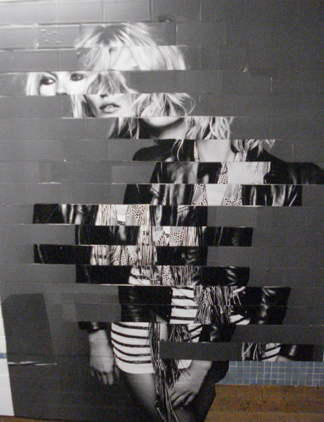
-can also move from one page to another, like a puzzle with images crossing over pages

-captions showing who illustrator/photographer is

-contents page on inside cover?